Our Logo
Creekside's logo comes in two varieties, the logo and the logomark. For places where Creekside's brand has been well established or in constrained spaces, the Creekside Logomark may be used. When in doubt, use the full logo.
Note: While the logo is stylized in lower case, use title case when writing our church's name in a document.

Do use the appropriate color
Our logo comes in three colors; Creekside Blue, white and black. The logo should be distinguishable from the background.
Don't modify the logo
Do not edit, change, distort, recolor, or reconfigure the Creekside logo. Do not use the font abeatbykai in place of the logo graphic.

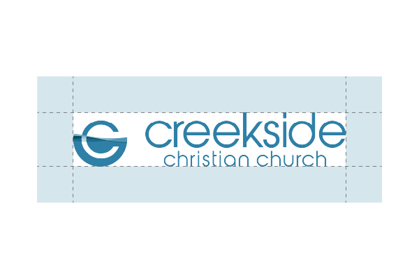
Give the logo space
The amount of clear space around the logo is demonstrated in the downloadable graphic with negative space.
Don't crowd the logo
Crowding the logo with images, text, or other graphics reduces its impact. The logo should not get lost in your design.
Download Our Logo
Get high quality versions of all Creekside logo variations from our Dropbox.
